· 6 min read Posted by Gustavo Fão Valvassori
Exploring Compose Web

Now that we know how to create a compose application, we can start exploring how to render composable components and combine them all. In this article, we will explore a few basic components, how they appear on web, and how to customize them.
Basic elements
If you already have Compose experience, this one should not be a big mystery. You call a Composable Function, like
Text(), send data as an argument, like a string, and it renders on the screen.
@Composable
fun MyTextComponents() {
    Text("This is a text")
}
This code will result in the following UI and HTML elements:
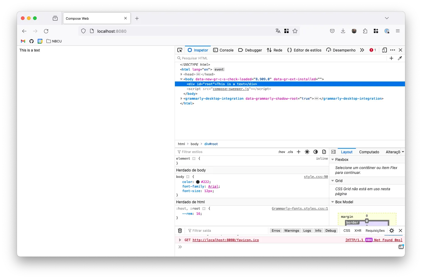
But, if you look closer, it only renders plain text, with no formatting tags. With that in mind, you are probably asking questions like “How do I change the font size or make the text bold?”. And the answer is much easier than you expect: you use a composable component.
If you already have some HTML experience, you know how to apply changes to your text:
<span>for some inline text;<p>if you need a paragraph;<h1>to<h6>if you need a title;- And so on…
And the way you use it with Compose is pretty similar. But in this case, you will use the Compose syntax instead of HTML:
@Composable
fun MyTextComponents() {
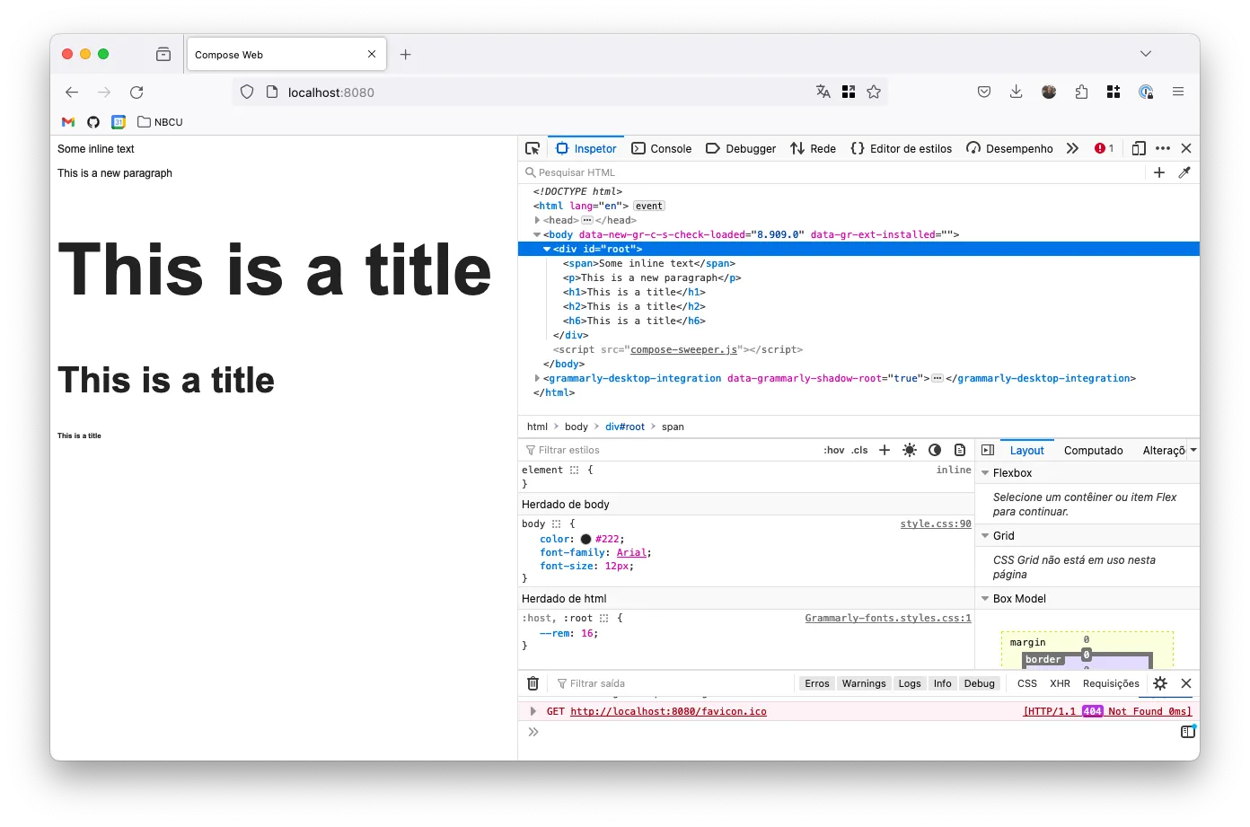
Span { Text("Some inline text") }
P { Text("This is a new paragraph") }
H1 { Text("This is a title") }
H2 { Text("This is a title") }
H6 { Text("This is a title") }
}
And as you can see bellow, it resulted in the following HTML elements:
Attributes
Now that we know the basics let’s move forward. The next thing you should probably be asking is about the HTML Tag attributes. How do I add a class to my element? How do I add an ID?
Let’s use a simple form to explain how to do things. We can learn how to set element attributes and listen for events with it.
@Composable
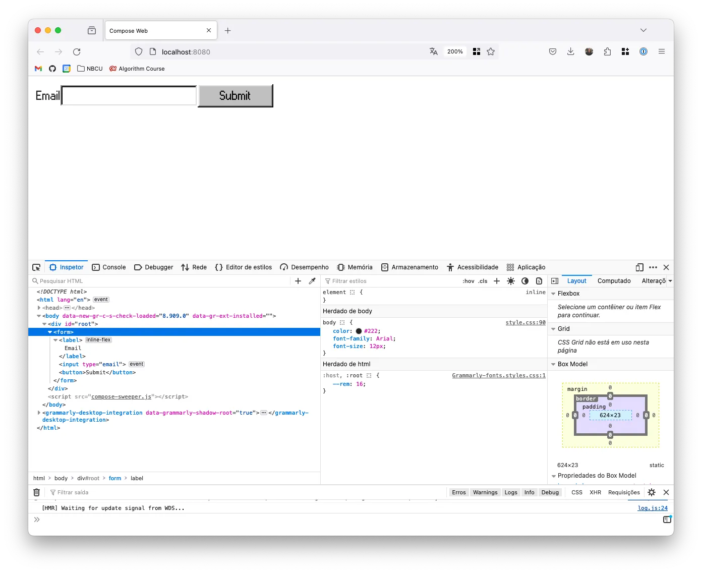
fun MyFormComponent() {
Form {
Label { Text("Email") }
Input(type = InputType.Email)
Button { Text("Submit") }
}
}
This code is a simple form with a label, an input, and a button. It has no actions implemented yet. So, nothing happens if you click the label or the button, change the text, etc. All you have are UI elements like the screenshot below:
Now, we need to set the attributes for those elements so they can behave appropriately. For that, we need to:
- Set the ID of the input so the label can focus on it when clicked;
- Set the
forattribute on the label so it can focus on the input; - Set the
typeof the button so it can submit the form; - Store the email on a state variable;
- Add a listener to the form submit event so we can handle the form submission;
If you are familiar with Compose, you already know that you can do most of the customizations on components using the
Modifier. We don’t have it on the HTML version of compose, but we have a similar solution. Here, we use the
Attribute Builder syntax. Instead of an object that we mutate and pass to the component, we use a lambda that receives
all modifications and applies to the element.
@Composable
fun MyFormComponent() {
    var email by remember { mutableStateOf("") }

    Form(
        attrs = {
            // 5. Add the listener
            onSubmit { event ->
                event.preventDefault()
                println("Email: $email")
            }
        },
    ) {
        // 2. Setting the 'for' attribute
        Label(forId = "email-input") {
            Text("Email")
        }
        Input(
            type = InputType.Email,
            attrs = {
                // 1. Setting the input id
                id("email-input")

                // 4. Listening for changes and storing the value
                onChange { email = it.value }
            }
        )
        Button(
            attrs = {
                // 3. Setting button type
                type(ButtonType.Submit)
            },
        ) { Text("Submit") }
    }
}
In this example, you can better understand how to set attributes on the elements. You can also see how to listen to
events and store the state of the form. It is worth noticing that some elements have helper properties, so you don’t
need to implement the attrs lambda. For example, the Label component has a forId property that will automatically
set the for attribute on the element.
If you don’t see the property method you need on the component, you can always use the attr function and set it
manually.
@Composable
fun CustomAttributeExample(ariaLabel: String) {
    Button(attrs = {
        attr("aria-label", ariaLabel)
    })
}
If this becomes a regular thing on your project, you can extract it into an extension function:
@Composable
fun CustomAttributeExample(ariaLabel: String) {
    Button(attrs = {
        ariaLabel(ariaLabel)
    })
}

fun AttrsScope<HTMLElement>.ariaLabel(label: String) {
    attr("aria-label", label)
}
Slot-based components
Slot-based components is a way of providing flexible and customizable components. This pattern relies on having composable functions as arguments so you can customize the component.
On Compose for JS, it provides a custom type used on most of the slot-based components.
@Composable
fun Div(
    attrs: AttrBuilderContext<HTMLDivElement>? = null,
    content: ContentBuilder<HTMLDivElement>? = null
) {
    TagElement(
        elementBuilder = Div,
        applyAttrs = attrs,
        content = content
    )
}
As you can see, it uses two types of lambdas: AttrBuilderContext and ContentBuilder. The first is used to customize
the attributes of the element (as previously discussed), while the second is used to customize the element’s content.
In other words, the second one is the slot parameter.
If you check the type implementation, you can see that it’s a lambda type for the TagElement you are using:
typealias AttrBuilderContext<T> = AttrsScope<T>.() -> Unit
typealias ContentBuilder<T> = @Composable ElementScope<T>.() -> Unit
Using them, you have better support from Compose as you have the element reference and other useful methods. But, in most cases, you may not need it. Mainly because of the following reasons:
- A simple composable function is enough for most cases;
- Most HTML elements are already supported out of the box, so you may not need to create your own;
- In case you need to create your own, you may need to use a considerable amount of time;
- In case you are creating wrapper components, you can use the original type as arguments;
Just in case you need to create a wrapper component and want to know how to do it, here is a basic example:
@Composable
fun Container(
    attrs: AttrBuilderContext<HTMLDivElement>? = null,
    content: @Composable  ElementScope<HTMLDivElement>.() -> Unit,
) {
    Div({
        attrs?.invoke(this)
        classes("my-container")
    }) {
        content()
    }
}
This can be useful for an internal design system library or even create types for CSS libraries, like Bootstrap.
Final Thoughts
In this article, we learned how to use the basic elements of Compose for HTML. How to set element attributes, and how slot-based components work on Compose JS.
In the following article, we will learn how to change component styles and use CSS Libraries.